Loading...
Data is loading.
Select a pin on the map to see more details.
This dashboard helps you track and view air quality data from different cities and neighborhoods in the Greater Cincinnati area. It shows air quality index (AQI) data on maps, line graphs, calendars, and tables. Uniquely, this dashboard also allows you to group locations together and compare their air quality over time.
Groundwork Ohio River Valley (GWORV) is a local nonprofit whose mission is to regenerate, improve, and manage the environment by building community-based partnerships. GWORV empowers people and organizations to work together for environmental, economic, and social well-being.
GWORV sought to address gaps in air quality data across Cincinnati. Many neighborhoods previously had little to no information about the air residents were breathing. To help change that, GWORV began working with young people and community members to collect local air quality data. As part of this effort, GWORV installed seven continuous air quality monitoring stations throughout Greater Cincinnati.
The dashboard was created to make this data accessible and understandable. It helps track air quality in these communities and supports efforts to advocate for cleaner, healthier air.
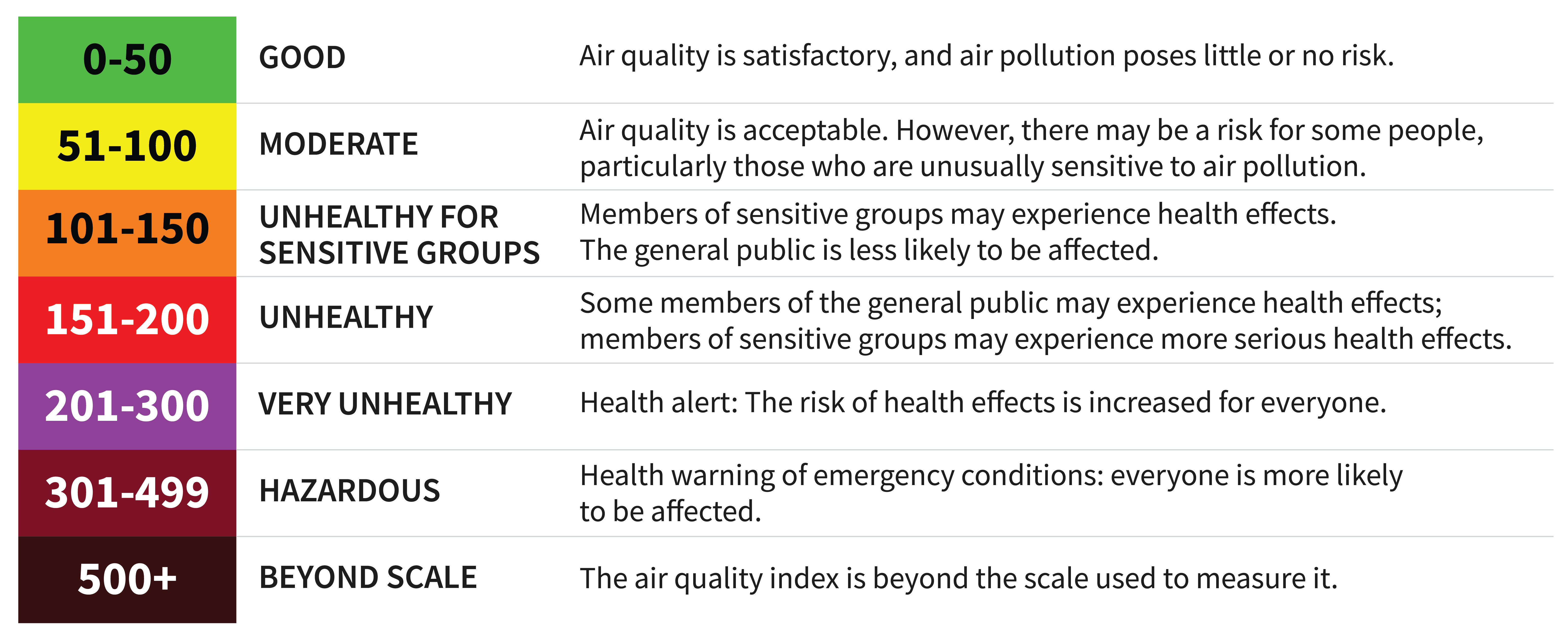
The AQI measures air pollution and shows how it affects health. The Environmental Protection Agency (EPA) uses colors to show how bad the pollution is:
This dashboard's air quality data is split into two types:
Station data comes from monitors from the Environmental Protection Agency (EPA), Purple Air (public data collection), and GWORV (local nonprofit using AQMesh monitors). Station Data monitors typically record air quality 24/7.
Resident data is collected for shorter time periods, like monitors in people's homes (Temtop) for about 7 days, mobile monitors (Airbeam) worn by residents for about 7 days, and monitors (Airbeam) on a bike route in Lower Price Hill. GWORV works with local residents and youth to collect this data.
Currently, data is available from March 2024 to August 2024.
Check out the Map page to see a broad overview of air quality across the region for both station and resident monitors.
Visit the Detailed Summary and Location Comparison page for more detailed information about air quality over time. You can also compare air quality between two groups of cities or neighborhoods using the Group 1 and Group 2 dropdown menus.
This page shows the air quality for different monitors across the area. Each monitor is represented as a pin on the map. When you click on a pin, a pop-up appears with information about that monitor, like its average air quality score (AQI) and the category it falls into for the chosen time period.
You can filter the data in 3 ways:
1) Choose a specific date and time range.
2) Select from All Readings , Station Readings , or Resident Readings . Resident Readings usually last 7 days, while Station Readings are collected around the clock.
3) Pick which cities or neighborhoods you want to see on the map.
When you click on a pin, you'll also see a graph below the map showing how the AQI changed over the selected time period.
This page helps you compare air quality data from multiple monitors. For example, if you choose 'Newport' from the city menu, it will show data for all monitors in Newport. You can also compare two different locations by selecting different cities or neighborhoods in the drop down menus for Group 1 and Group 2.
There are 3 section tabs on this page:
1) The calendar plot shows the average AQI for each day in the group(s) you selected.
2) The line plot displays the average hourly AQI over time as colored points. You'll also see lighter gray lines showing individual monitor readings from the selected group(s).
3) The summary table gives useful insights, like the percentage of hours with good air quality, the worst day of the week for air quality, and the best week for air quality during your selected time range.
Please note, this page only includes Station Readings (data collected over longer periods). Resident Readings (collected for short periods like 7 days) are not included because they are only collected for a brief time period, making them less helpful for comparisons.
Exposure to poor air quailty can affects a person's lungs and heart. This can lead to: premature death in people with heart or lung disease, nonfatal heart attacks, irregular heartbeat, aggravated asthma, decreased lung function, increased respiratory symptoms, such as irritation of the airways, coughing or difficulty breathing. Visit the EPA's website at the link below for more information.
Health and Environmental Effects of Particulate Matter (PM) - EPA
First, remember that this dashboard shows past data, not current air conditions.
A high reading in the past doesn’t always mean the air was dangerous. Sometimes, sensors can give odd results because of things like spider webs, dust, or a technical glitch.
Even when sensors are working well, air quality can vary a lot from place to place. Things like traffic, nearby industry, weather, or where the sensor is placed can all affect the numbers.
Use this dashboard to explore patterns and trends over time. If you're concerned about current conditions, check a trusted real-time air quality source for up-to-date information.
This dashboard shows air quality data from different sources: government monitors (like the EPA), public networks (like PurpleAir), and local community sensors (like GWORV). If you don’t see data for a certain place or time, it likely means that the sensor was offline or hadn’t been installed yet. We included all data available from March-August 2024.
Average AQI is calculated by calculating the average PM2.5 of that time period, then finding the corresponding AQI value for that PM2.5 value. This is based on breakpoints the EPA has set. Note we are using the recently revised (2024) breakpoints.
Station Readings from both the EPA and Purple Air are available to the public online in a variety of formats. Learn more at:
The AQ Mesh monitors were purchased and installed by GWORV. The data is not publicly available outside of this dashboard.
GWORV's air quality project uses TemtopM10i monitors for residents to measure their indoor air quality over the course of 7 days. AirBeam3 mobile monitors are used for both the bike ride data collection and as a wearable monitor for residents over the course of 7 days. The Airbeam3 monitors are enabled with GPS.
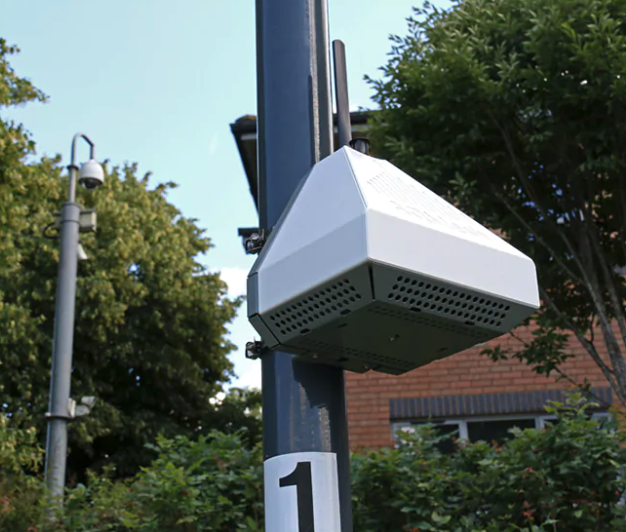
AQ Mesh Monitor
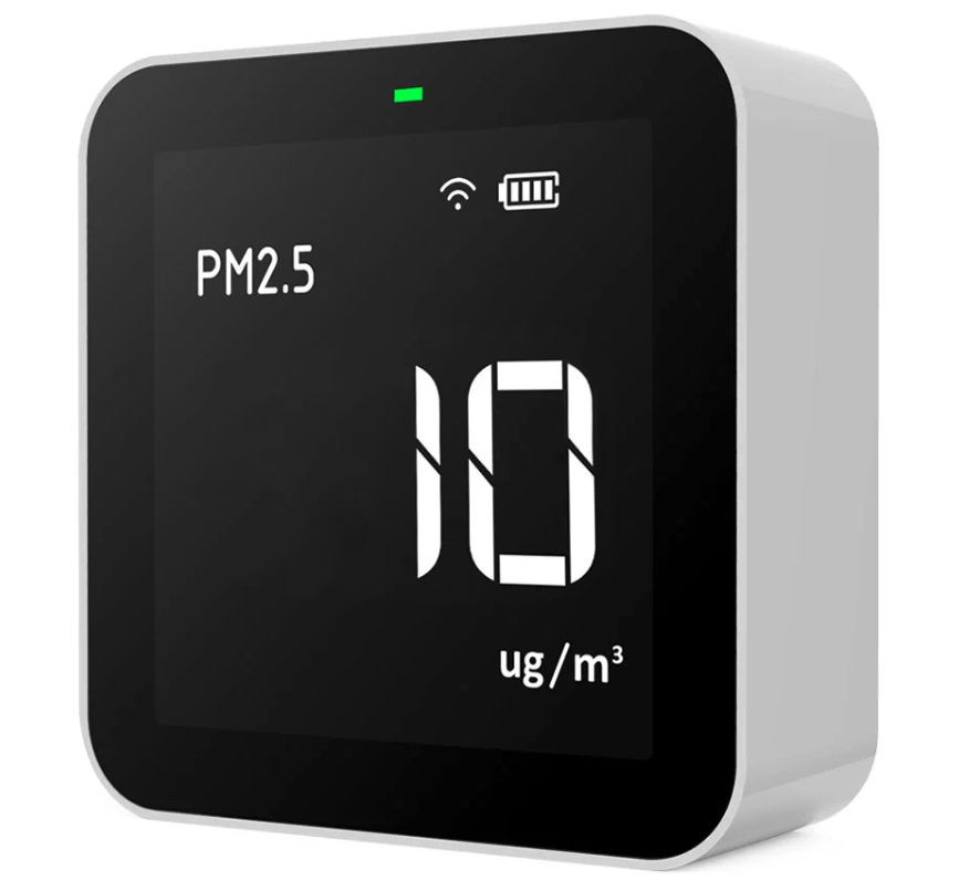
TemtopM10i Monitor
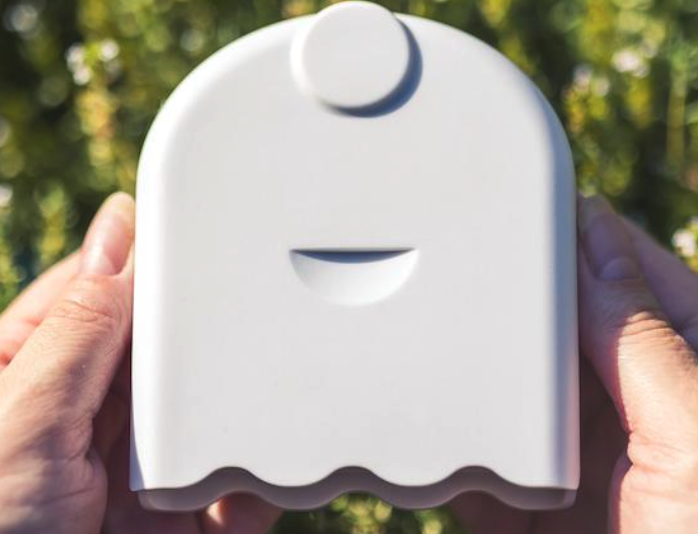
AirBeam3 Monitor

Youth Green Team recording air quality data on a bike route.
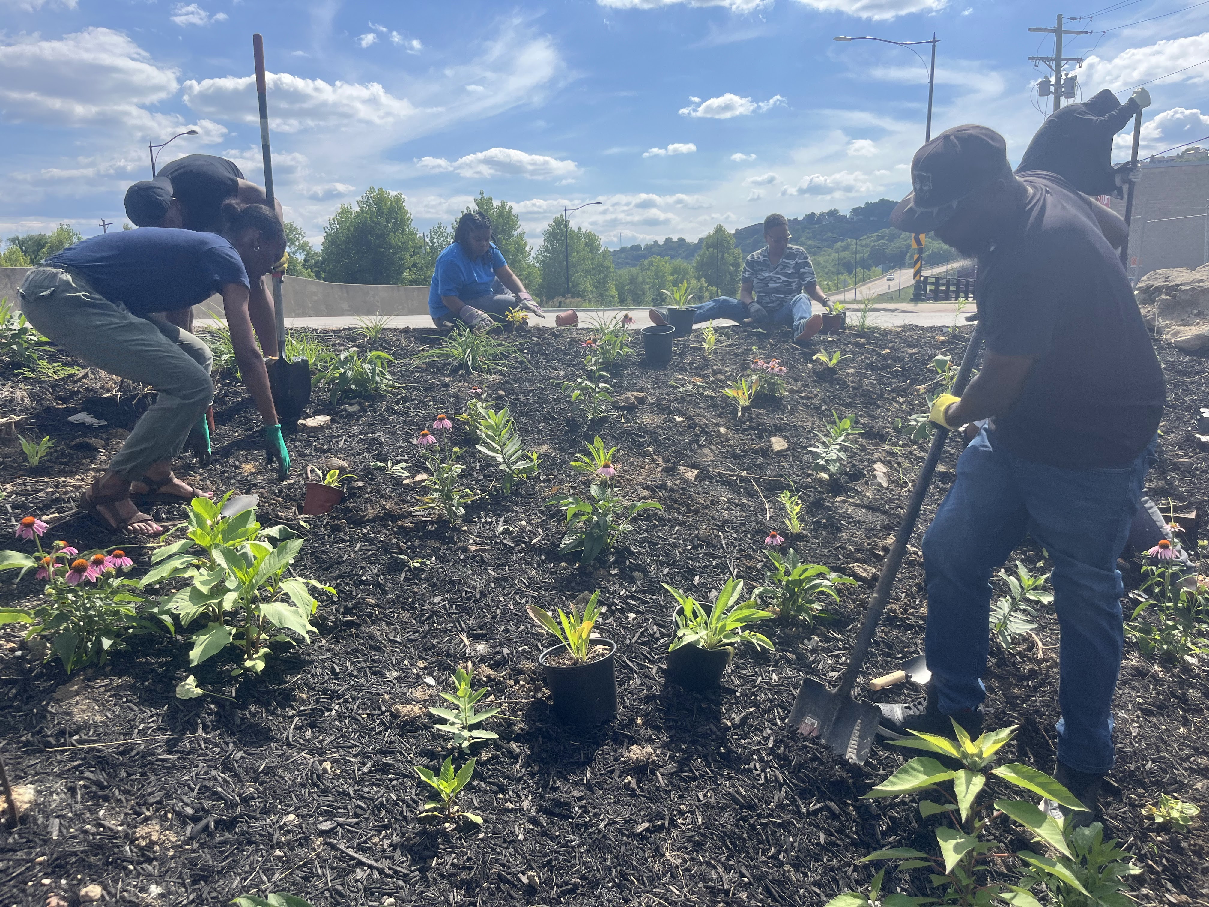
Local residents create a rain garden.
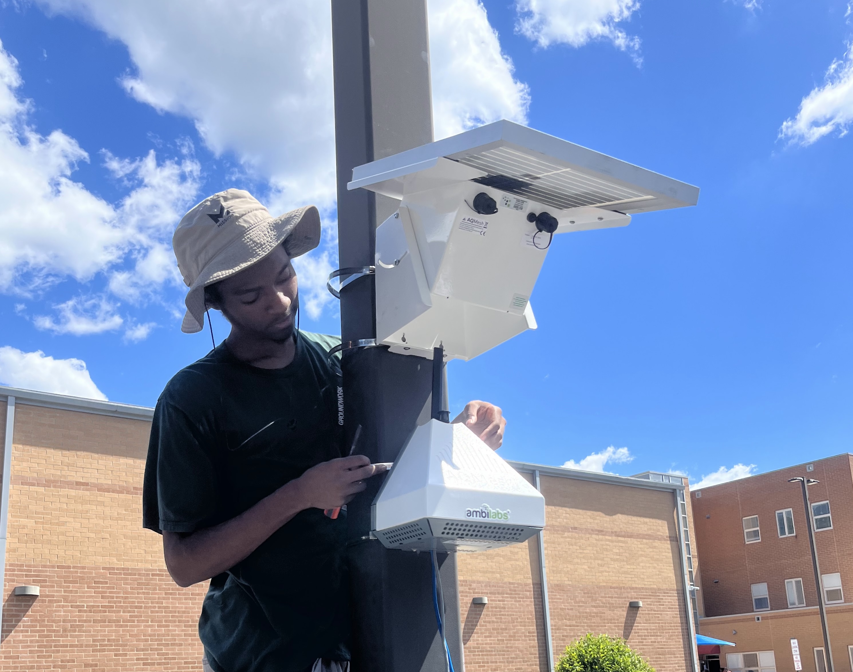
Installing an AQ Mesh air quality monitor.